Data Visualization
Damon Patrick Carroll’’s Career Path
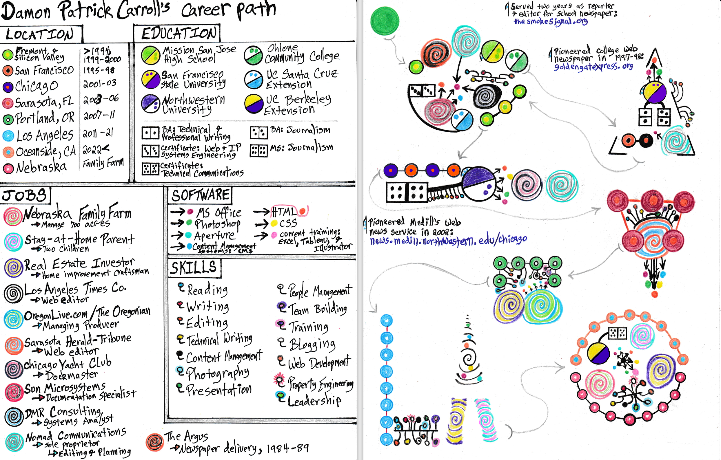
Resume as a Hand-Drawn Data Visualization
I created a hand-drawn explanatory analysis of my resume that resembles a flow chart. My design theory incorporates the four most common visual design principles: contrast, proximity, alignment, and repetition. As for design elements, my drawing makes use of color, direction, and shapes to keep the composition organized and moving.
My data set includes five categories: location, education, jobs, software, and skills. Each category uses a different pictorial symbol, and each value within the category uses a different color scheme. The education category is segmented into schools and degrees. The categories are clustered into shapes and layered onto a metaphorical pathway that uses three types of data analysis: correlation, time series, and geospatial.
Gestalt Principles
I turned to Gestalt Principles for guidance when I formed the shapes. I used the principles of proximity, similarity, enclosure, closure, continuity, and connection. Unfortunately, the oval looks more like a dented egg. C’est la vie. I am fond of the mirrored triangles. I created a logotype for “LA,” and I incorporated a rectangle, a square, and a circle.
Correlation Analysis
As the viewer moves through the clusters, they discover that my education, skills, and technical capabilities evolve. The final cluster is the result of the combined experiences of all the clusters.
Time-Series Analysis
My drawing spans 40 years from 1984 to 2024. My skills, academic degrees, and technical capabilities evolved through time. My family, financial investments, and responsibilities grew through time.
Geospatial Analysis
My drawing represents a map that details eight changes in physical locations over 30 years. I lived in three corners of the United States. My formative years of education and training are rooted in Silicon Valley, the mecca of technology. The final cluster shows that I live in one spot while also conducting affairs in another.
Data Visualization
Giorgia Lupi and Stefanie Posavec
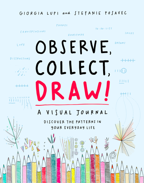
I recently interacted with a book called ‘Observe, Collect, Draw! A Visual Journal. Discover the Patterns in Your Everyday Life.’ Its authors, Giorgia Lupi and Stefanie Posavec, are award-winning information designers who participated in a year-long drawing project. The artistic results inspire me.
Lupi’s company (accurat.it) is at the forefront of information design. I first learned of her work through this Medium profile: The Architecture of a Data Visualization: Multilayered Storytelling through ‘Info-spatial’ Compositions.
Storytelling with Data
Cole Nussbaumer Knaflic
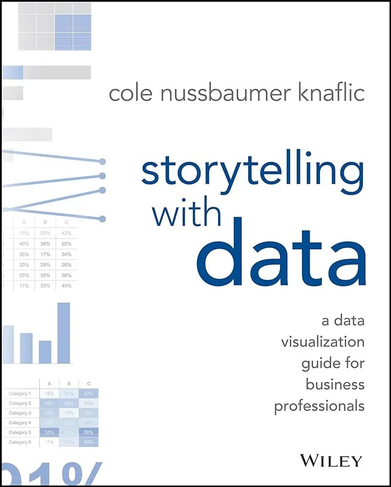
Her book, Storytelling with Data: A Data Visualization Guide for Business Professionals, is at the heart of my interest in technical writing. A helpful Medium article details the “key take-aways” of Knaflic’s book, and why it’s so popular with business professionals.


